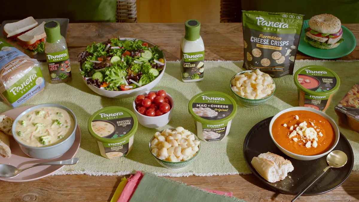
Finding Panera in Store
Panera Bread


The Challenge
Panera Bread's consumer packaged goods (CPG) product line brings the Panera Bread taste and quality you crave to your local grocery store. Panera Bread's CPG marketing team wanted to increase engagement on its digital experience platform, where customers can browse products, find local retailers, and review craveable and inspirational recipes. Due to the previous layout, users encountered frustration and ultimately abandoned the site. The navigation prevented them from fully immersing themselves in the brand and exploring Panera’s grocery items. Part of the journey felt fragmented, directing visitors to the website footer, or forcing them to retreat to the homepage instead of driving them to the store locater in a cohesive, contextual experience.

The Solution
Panera Bread engaged with Verndale's Digital Marketing and Experience Design teams to explore opportunities for website optimization. Starting with a measurement planning workshop, we leveraged Google Analytics, Google Tag Manager, and Crazy Egg to assess the site's activity. We analyzed heatmap and event tracking data, search trends, competitive intelligence, and digital traffic behavior.
The workshop revealed obstacles and vulnerabilities that helped fuel a strategic roadmap for a data-driven solution to address site navigation inefficiencies. We designed and built purpose-driven features to help direct visitors immediately toward the main call to action to find a store. Design and UX enhancements included revisions to the button naming conventions and revamping the style for emphasis. Lastly, we reordered the navigation based on user interest and implemented web and mobile styling parity.


The Outcome
The research and expertise implemented in the new navigation and design drove higher website engagement. With an intuitive journey, the changes expose the "Find the Store" call-to-action at all times. It led to over 56% of clicks on the primary navigation going to the "Find a Store" landing page, compared to only 23% of clicks that previously went to the "Where to Buy" landing page. Panera at Home's primary navigation panel accounted for over 70% of all navigation over three months, compared to 61% from the same time one year before. Additionally, the website footer had a significant activity decrease, revealing only 14% of navigation interactions, down from 24%.
Increase in "Find a Store" Clicks
Visitors Using the Main Navigation
Decrease in Footer Clicks


Get in Touch
Success Stories

Landry's
Sitecore

SeaWorld
Sitecore
